Why Use an Event Directional Banner?
Event Directional Banner systems help visitors move through busy venues with less hesitation. They guide people from parking areas to registration desks, exhibition halls, restrooms, and emergency exits. Clear signs can reduce repeated questions and improve the arrival experience. Visibility matters. A well-placed banner gives immediate direction before confusion develops.
In my experience, effective wayfinding depends on more than attractive graphics. The message must be brief, readable, and positioned at the viewer’s eye level. Large lettering, strong contrast, and consistent arrows remain useful in bright sunlight and crowded spaces. Professional event planners often study visitor flow before choosing banner locations. They consider walking distance, entrance angles, lighting, and possible obstructions. These details support safer and more efficient movement without overwhelming guests.
An Event Directional Banner also strengthens event organization. Branded colors and consistent typography make separate areas feel connected. Guests may trust the venue more when every sign looks deliberate and current. However, design choices can still miss the mark. A banner that looks impressive from a distance may become unreadable up close. An arrow can also create uncertainty when placed beside multiple pathways. Testing signs with unfamiliar visitors can reveal these weaknesses before the event begins. That small step is easy to overlook.
Reliable directional signage should complement staff support, not replace it. Human assistance remains valuable for accessibility needs, schedule changes, and unexpected crowd movement. When planning is careful and practical, directional banners become more than decoration. They create a calmer path through the event and help visitors spend less time searching.
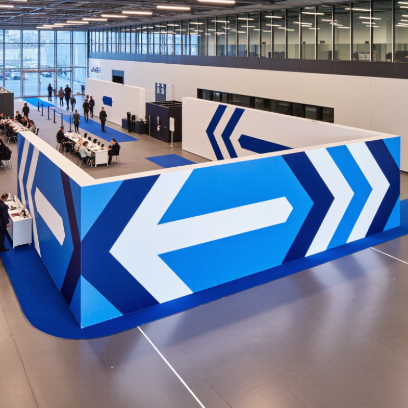
What Is an Event Directional Banner?
An event directional banner is a large, visible sign that guides people toward a specific event area. It answers a simple question: “Where should I go now?” Unlike a promotional display, its main job is movement, not persuasion.
You may see one beside a parking entrance, outside a venue, or along a hallway. Clear arrows, readable lettering, and a short destination name help visitors decide within seconds.
At a busy conference, I have watched guests pause when arrows pointed in two directions. That small delay created a queue near the registration desk. A well-planned banner reduces confusion by matching the visitor’s route, sightline, and walking speed.
Effective banners use strong contrast, weather-resistant material, and lettering large enough for distant readers. The design should remain understandable for people with limited vision, limited language skills, or mobility needs.
Place signs before a decision point, not after it. A banner hidden behind a tree or crowded with details may look attractive but fail its purpose. Measure the viewing distance during setup, then adjust the height if people block the lower edge.
Test the route with someone unfamiliar with the venue. Their hesitation can reveal a problem the organizer misses.
Perfection is not guaranteed. Outdoor light changes, and one arrow may still be overlooked. That is why checking the signs during the event matters.
How Event Directional Banners Guide Visitor Movement
At a busy event, visitors rarely read every sign. They scan for direction while carrying bags, checking schedules, or following a colleague. An event directional banner turns that brief glance into a clear movement cue. Large arrows, strong contrast, and plain words can show where registration, halls, restrooms, or exits are located. Placement matters as much as design. A banner near the entrance should answer one question: “Where do I go now?” Another sign at a corridor split should confirm the choice, not create new confusion. Keep routes visible.
From working with event layouts, I have found that people trust signs they can read from several steps away. Letter height, lighting, viewing angle, and crowd density all affect that trust. A beautiful banner may fail when a pillar blocks half the arrow. Test it during setup. Walk the route like a first-time visitor, then adjust the height or position. Repeated wording helps visitors remember a route, especially in large venues. Still, perfect guidance is difficult. A small wording inconsistency can cause hesitation. Too many banners can make a space feel noisy, while too few leave guests stopping in doorways. Staff feedback and visitor questions reveal weak points that a floor plan may miss. Directional banners work best when they support real behavior, not decoration.
Key Benefits of Using Event Directional Banners
Why Use an Event Directional Banner?
Key Benefits of Using Event Directional Banners
Event directional banners turn crowded venues into easier journeys. They guide visitors from registration desks to halls, stages, restrooms, and emergency exits. Clear arrows reduce hesitation near busy intersections. They also create visible checkpoints for guests carrying bags, coffee, or event materials.
The 2024 Global Meetings and Events Forecast reported that 67% of professionals expected in-person attendance to increase. More attendees mean greater movement and more opportunities for confusion. UFI’s 2024 Global Exhibition Barometer also recorded continued growth in exhibition activity across many markets. Directional banners help teams manage this movement without adding more staff. They are practical tools, not decorative extras.
Use short wording, strong contrast, and arrows visible from several steps away. Place signs at eye level and repeat them after major turns. A visitor should not need to stop and study the layout. Small details matter. Yet, a banner cannot repair a badly planned floor plan. That is an easy mistake to overlook. Test the route with someone unfamiliar with the venue. Watch where they pause. Adjust the placement before opening. Even experienced event teams sometimes trust their own familiarity too much.
Essential Design Elements for Clear Event Navigation
An event directional banner does more than announce a gathering. It reduces hesitation when visitors enter an unfamiliar venue. Clear navigation begins with a visible destination, not decorative language. Use a short heading such as “Registration Hall” or “Workshop Rooms.” Keep it readable. A tested banner usually places the main message at eye level, where moving guests can scan it quickly. In busy entrances, people rarely stop for dense paragraphs.
Effective design depends on hierarchy, contrast, and distance. The destination should appear largest, followed by an arrow and a brief supporting detail. Use one directional symbol consistently throughout the venue. High-contrast lettering improves visibility in dim corridors or bright outdoor spaces. Leave enough empty space around the arrow. Crowded layouts make simple instructions feel uncertain. Choose durable materials that resist wind, light rain, and repeated handling. Safety information must remain visible near stairs, vehicle paths, and temporary barriers.
From event setup experience, banners work best when organizers walk the route before opening. This reveals blocked sightlines, confusing turns, and signs placed too late. Measure viewing distance, then adjust letter size instead of guessing. Test it. Ask someone unfamiliar with the venue to follow the signs alone. Their hesitation is useful evidence. I once approved a banner that looked balanced on a screen but disappeared beside a tall entrance. That mistake changed my process.
Where and When to Place Event Directional Banners
Why Use an Event Directional Banner?
Event directional banners work best when placed before confusion begins. Put the first banner near parking entrances, shuttle stops, or public transport exits. Visitors should see the next instruction before they search for it.
At major intersections, use large arrows and short wording. Place another banner at the building entrance, then repeat the message near elevators and registration areas. A 2024 Global Meetings and Events Forecast reported that 78% of professionals expected attendance to grow. More visitors can mean more arrival pressure. Clear signs reduce hesitation, especially during busy opening minutes.
Height matters too. Keep key text within a comfortable viewing range, and avoid placing banners behind plants, columns, or temporary displays. The World Health Organization reports that 16% of people worldwide live with a significant disability. Directional banners should use strong contrast, readable type, and simple symbols. Keep pathways unobstructed. Never let a banner block an emergency exit or essential safety instruction.
I have learned that more banners do not always improve wayfinding. Sometimes they create visual noise. A small venue may need only three carefully tested positions. Walk the route as a first-time visitor, preferably during setup and peak arrival. I still miss unclear turns occasionally. That is why staff feedback and a short onsite test remain valuable.
| Placement Location | When to Install | Primary Purpose | Practical Placement Guidance |
|---|---|---|---|
| Approach roads and event entrances | Before attendee arrival, allowing time to check visibility and secure mounting. | Help visitors identify the correct entrance and reduce missed turns. | Position where permitted and visible to approaching traffic. Keep signs clear of roadways, sightlines, and pedestrian paths. |
| Parking areas and drop-off zones | Before parking opens or the first scheduled arrivals. | Direct drivers and passengers toward parking, accessible drop-off, or event check-in. | Use clear arrows and brief wording. Place signs before decision points, not after them. |
| Walkways and route junctions | After the route is finalized and before attendees begin using it. | Show the way to registration, session rooms, exhibits, restrooms, or exits. | Place at eye-catching decision points and repeat directions where a route changes. Keep walkways unobstructed. |
| Building entrances and lobbies | Before doors open; recheck after furniture or queues are set up. | Guide guests from the entrance to check-in and key event areas. | Mount or position banners where they can be seen from the approach, without blocking doors, emergency equipment, or required notices. |
| Temporary outdoor routes | After setup and a walk-through of the full attendee route. | Direct people around temporary closures, construction, or event-specific paths. | Use stable supports suitable for local conditions. Inspect regularly and remove or reposition signs if conditions change. |
| Venue exits and transport pickup points | Before the event ends or attendee departures begin. | Help visitors find exits, transit stops, taxis, or designated pickup locations. | Keep directions consistent with venue guidance and temporary traffic arrangements. Do not cover official safety signage. |
Article Source:
Contact Us
Phone: (650) - 522-4653 (GOLF)
Fax: (650) 522-7511
Tee Time Reservations: (650) 522-4653 (GOLF)
Location
1700 Coyote Point Drive
San Mateo, CA 94401